
A LIGHT SPARK.

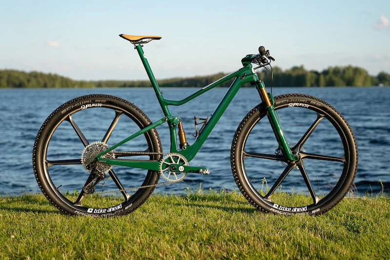
It was the colour that first stopped me in my tracks. Honestly looking back I couldn’t tell you if it was the red or green I saw first. But what I did immediately see was a block of colour not usually found in the bike industry and very rare on a mountain bike. The more I looked the more it fell into the aesthetic of my other love, wheels with engines 2 or 4 not really fussy. Block colour is not common primary block less so and with the exception of Yeti I do not really associate any brand with a specific colour. When I think of GT I still think Blue with the Pollock-esque paint splatter but now I am just showing my age
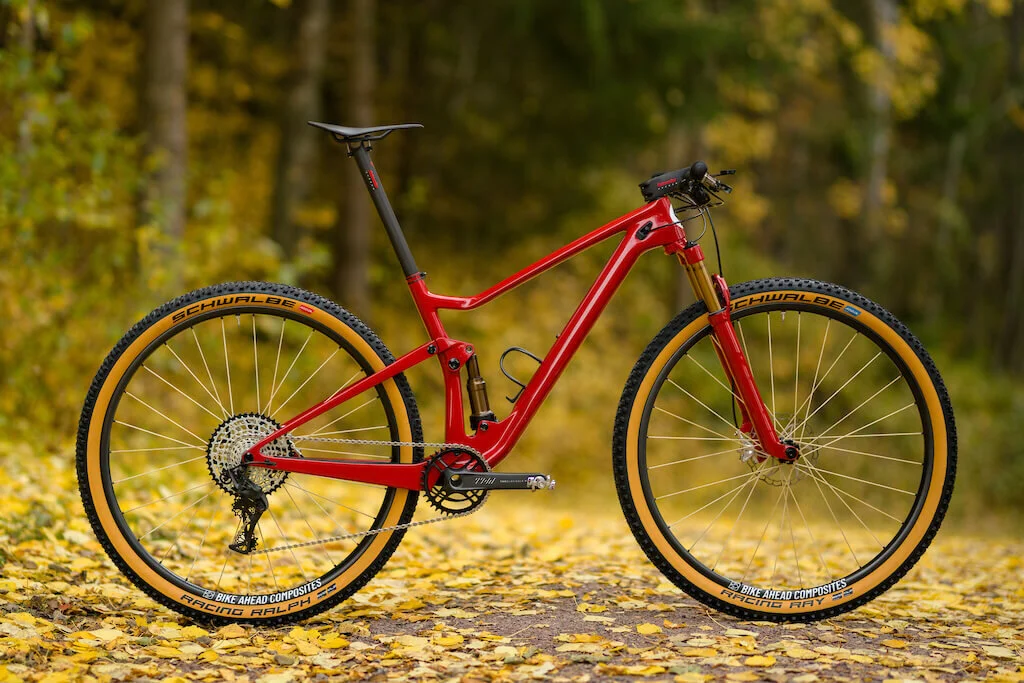
I suppose in essence a bike, especially a mountain bike is designed as a tool to function as is its primary objective if it can have some kind of aesthetic appeal then great. Obviously beauty is in the eye of the beholder but I think it is fair to say many bicycle engineers would sacrifice perceived looks for the smallest gain in performance. I currently have a Yeti and doubt I will ever choose another brand I have also been longing recently for an OPEN both of which share certain sensibilities in design and company ethos. I am sure my 10 year obsession with Yeti comes from a place similar to where Gustav comes from when he attacks his bikes with a knife to remove a typically benign factory pate finish in search of a simpler place yes it saves weight but it also always seems to highlight design. Yeti’s have always had clean lines with perfect swoops and a silhouette hard to mistake. For me what makes the lines easier to understand is that bold turquoise colour.

Okay less Yeti more Scott. For me the Dangerholm look is reminiscent of a motorcycle more than mountain bike and I think it comes down to the fact that cars and bikes have panels and fairings and this allows so much to be hid which keeps the eye from distractions and allows it to concentrate on silhouette not details but also a big solid surface to which really consider what will be applied to it. Gustav’s bike to me seems to start of with a singular vision which can be removed from the engineering side of bike design as that’s somone at Scott’s issue.
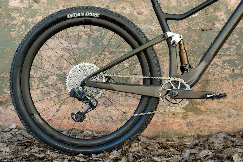
He can then look at a bike in principal should be good, but to him and me it is fussy. The lines are blurred the image is not striking enough and some of the functionality way to complicated. In the automotive industry we don’t pick a wheel just because it is the lightest or strongest we also choose because we want it to fit in with an overall look and feel and I doubt wheel choice for a bike brand has ever come down to how a wheel or tyre combo looks.
Maybe aesthetic choices should not come in to it but I think we are in a time where performance across the board is very good so it is a much smaller sacrifice to choose what will look the best. I have a FOX Transfer seat post because it is the best, no, its because its got Kashima like my forks and shock. The FOX is not the best but it is not the worst but does it look good, yep.

Maybe Gustav would think more strongly about the weight, his builds seem to have really increased in focus on weight but still to me thy look great but I wonder if he does see parts and think I want it but it just weights too much.
Nicholas Counsell